Beige-free neutrals
Some colours just demand attention. From a splash of spicy Mustard to a pop of Poppy, it's hard to miss our bright, bold hues. But we get it – loud colours aren't for everyone! If you love neutrals, our rainbow features plenty of them, and there's no beige required.
"I love colour, but home is my sanctuary," Becca says. "That's why I gravitate towards soothing, nature-inspired colours and neutrals."
While we're happy to see more and more people embracing bold, bright colours in their homes (check out the Unexpected Red Theory!), that doesn't necessarily mean doing away with timeless neutrals. Instead, it's about stepping away from sterile, harsh palettes as interiors lean into warm, rich tones and textures. We're seeing Millennial grey replaced by warm white and beige by Butter yellow (even Drew Barrymore's a fan!)
So if you're ready to dip a toe into the world of colour – rather than plunge in headfirst – here's where to start.

Blush
One of our most popular colours, Blush is a soft pastel pink – with a twist. We gave her a slight grey undertone to neutralise the pink, making her a hint of colour that's brighter than beige but gentler than fairy floss. Like spring petals and rosy cheeks, she's a blushing beauty, and she's also Jess' favourite colour. Blush pairs beautifully with greys, whites and natural textures like wood and ceramic, so she's the perfect first step into colour!

Butter
She's the newest addition to our pastel range, and Butter has made quite a splash. While she's bright enough to hold her own next to Poppy and Mustard, Butter is a true mellow yellow. With her dusky, muted shade, she makes a perfectly elevated, not-quite-neutral for a European-inspired palette.

Chalk
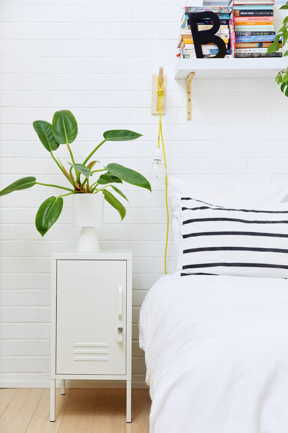
Anyone who's ever had to choose between warm white, cool white, whisper white, true white, off white (ok, we'll stop there) knows – there's more than one way to white! Our Chalk is the perfect warm, natural, tactile shade of white. With a creamy base, she makes a neutral space feel inviting and welcoming, and she brightens up a dark room without looking harsh or sterile.

Slate
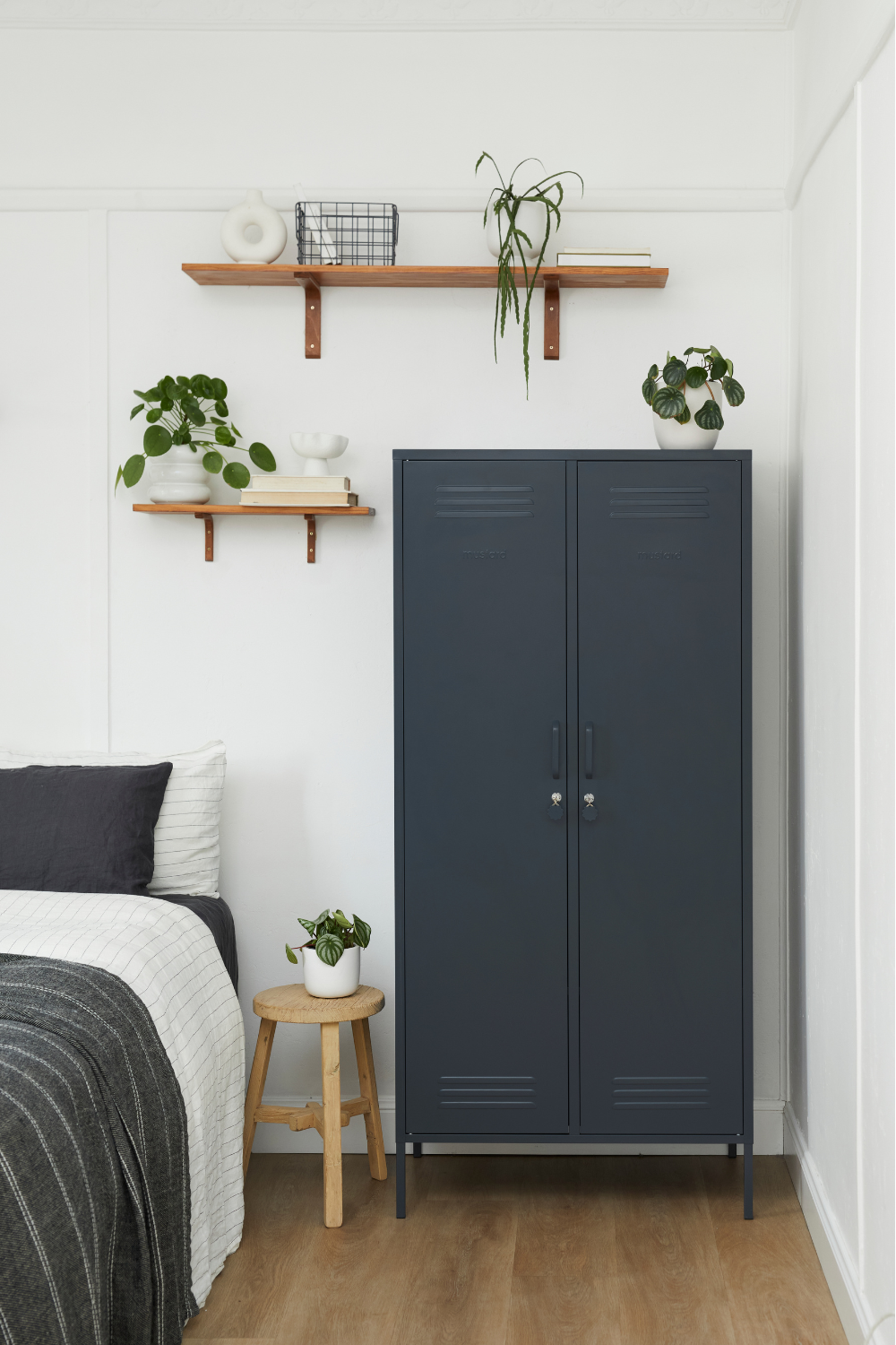
Ok, hear us out: Millennial grey may be on the decline, but Slate is no standard grey. With a dark blue base and a rich, moody tone, Slate is as close to vibrant as grey can get! She looks beautiful paired with Chalk for the ultimate decadent monochrome. Style her with Blush for one of our all-time favourite combos or Olive for a deep, dramatic look.

Sage
Ready to step a little further into the world of colour? Sage is our all-time bestselling colour, and it's easy to see why. Drawing inspiration from the grey-greens of nature, Sage is the ultimate soft, pastel shade. She looks right at home in neutral spaces without overpowering a room. If you want to dress white walls up, brighten a grey floor or give a beige room a lift, Sage is your step one.


